Just over 20 years ago, Pantone kickstarted their movement in selecting and presenting their pick for The Color of the Year. Every year, designers and consumers patiently wait for this particular trend forecast to help inspire their creative choices in the new year. And while it’s both a design and marketing strategy, Pantone has managed to build an empire surrounding this annual announcement.
Last year, Pantone chose “Living Coral” as the 2019 Color of the Year. The vibrant salmon-orange embodied exactly what our society needed at the time. With fiery hues and warm undertones, Living Coral “welcomes and encourages lightheartedness” despite the political climate we were living in a year ago. In addition, the shade gives homage to the beautiful nurturing aspects of coral reefs, hoping that this color can unite rather than divide people.
The Importance of The Color of the Year
To the untrained eye, The Color of the Year movement may seem simple, plain, and possibly even random - this cannot be further from the truth. Choosing one color that can accurately describe our current and future state requires years of in-field market research and observing trends from major influencers. On top of that, this announcement has quite a domino effect and raises other business implications. Selecting a Color of the Year signals to businesses and consumers that brand new products will be available soon. Making this announcement gives color and paint companies the opportunity to have a direct relationship with their consumers by giving them a heads up of what’s to come.
Ever since the first Color of the Year’s release in 1999, other color and paint giants like PPG and Behr have since joined the movement. With their very own interpretation and prediction of the new year, we are so excited to see what design trends we can expect to see in the near future.
Without further ado, let’s get into it.
Sherwin-Williams - Naval
Sherwin-Williams has had their own fair share of releasing bright and eye-catching colors as their hue of the year. However, their 2020 Color of the Year is quite a stark contrast to their picks of the past as well as what other color companies have chosen.
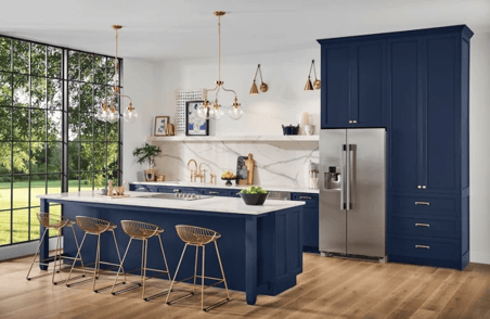
Photo: Sherwin-Williams
Naval is a gorgeous jewel-toned navy shade that is Sherwin-William’s pick for this year’s Color of the Year. With the current trend favoring designs with color blocking or monochromatic styles, bold rich colors like navy have been a go-to favorite in design. Naval is a sleek and sophisticated shade of navy that is versatile and can be incorporated into anything. And while this selection may seem out of place, Sherwin-Williams interpreted this year’s Color of the Year as a celebration for their past year. Whether it be a piece of cabinetry or bedroom walls, adding Naval-colored elements to your space will instantly add a touch of class.
Benjamin Moore - First Light
Introducing Benjamin Moore’s 2020 Color of the Year - First Light!
This soft pink-blush shade is much lighter than the once popular Millennial Pink. Various hues of pink experienced a boom a few years ago, with big-named brands like Glossier sporting all pink packaging on some of their products. Although bright pinks have seen their day and have started to fade into history, more refined and mature shades of pink have started to take their spotlight.
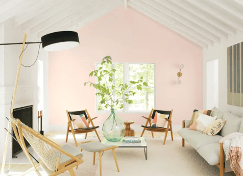
Photo: Benjamin Moore
Fight Light is a delicate pink shade that is perfect for any space looking for a cheerful color that is still tasteful and subdued. This fresh color complements the sun’s natural rays and gives any room a natural glow. Benjamin Moore has also released 9 other shades along with First Light that perfectly fit with the rosy shade.
Behr - Back to Nature
Similar to Pantone’s overarching message about sustainability and conserving our environment, Behr’s 2020 Color of the Year touches on how precious and precarious our natural world is currently.
“Back to Nature” is a light and organic hue of green that was inspired by the current trend of people bringing plants into their home. As we continue to spread greater awareness of our environment and Mother Earth, both dark and light shades of green will become increasingly popular.
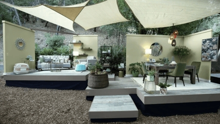
Photo: Behr
“There’s a huge trend of people bringing plants into their home, which cleans the air and has all these health benefits; that’s why we’re seeing jungle greens and desert greens. ‘Back to Nature’ is a sweet spot: it’s not too dark and not too light, it’s fashion-forward in these sense that it’s not too dated, [and it can] create a sanctuary in your home. It really has that indoor, outdoor appeal.”
Erika Woelfel, Behr VP of Color and Creative Services
Valspar - Natural Tones
Last but not least, Valspar is also heading in the direction of neutral tones inspired by nature, however they didn’t release just one shade in this Color of the Year season. You head us right, Valspar released 12 harmonious shades as part of their Color of the Year collection.
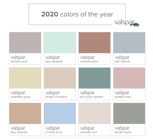
Photo: Valspar
Valspar’s release includes various shades of pinks, greens, and neutrals like Winter Calm, Desert Fortress, and Utterly Blue to name a few. All shades in this line of colors connects people with elements of nature all while encouraging a sense of calm. These beautiful shades are neutral enough that they can accompany any other color in any space, making it incredibly versatile.
To see all 12 shades for yourself, you can click here to see their full line of colors.
We hope you feel inspired by all these gorgeous hues of color. 2020 is coming soon, and we’re so excited to see all of these shades in action in the near future!
Want to see these shades up close? Access our Whitepaper here to learn how you can get started with designing for VR. For more inspiration on how you can showcase these Colors of the year with your clients, click here to download our Whitepaper on how to incorporate your VR experience into your next presentation and the benefits of VR in business.