New Jersey-based company Pantone has one of the most prominent voices in color. Whether it be a garment presented down a runway, or a house being redecorated, industries touched by color and reliant on visual aesthetics are keen to listen in on Pantone’s annual announcement of their Color of the Year. Every year, “Pantone picks a new color… based on socioeconomic conditions, fashion trends, new technologies, as well as new trends in the realms of lifestyle, art, music, travel, and of course, social media” (retrieved from CNN). Pantone’s process of picking the Color of the Year is much more thoughtful than many may assume. Through careful analysis, Pantone’s color experts meticulously analyze the current state of our society and assign a color that best fits the circumstances.
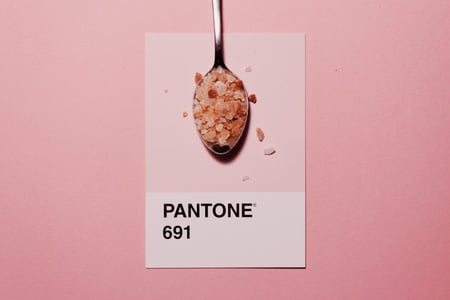
In December of 2018, Pantone announced that 2019’s Color of the Year would be Living Coral. Accompanying this bright and lively color has a much deeper meaning behind it. Before we dive into the intricacies of Living Coral and how advanced technology like virtual reality can help shape how to best incorporate it into our spaces, let’s explore the psychology of color.
The Psychology of Color
There is no doubt that color, for sighted people, is a powerful tool that can tap into a person’s emotions and convey a positive or negative message. How we receive the message is based on our understanding of what the color culturally means to us -- there is no universal definition for each specific color. From the Western perspective, we may view white as the color of purity, simplicity, and innocence. However, in many Eastern countries, white is the color associated with mourning. As humans, we approach color from a personal perspective that is heavily linked with our emotions. When examining your view of color, it is crucial to understand your demographic and the implications behind certain colors to tailor the best experience to them.
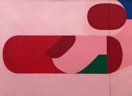 We give colors meaning - understanding the emotion it evokes will be crucial for those in VR design
Most notably, those in the field of marketing have masterfully used color to their advantage, utilizing it as a vessel to achieve their ultimate goals. Think of the most well known fast food chains and the colors they use in their logo. Many of their colors are bright and eye-catching, helping consumers identify and retain your branding with more ease.
The Meaning Behind Living Coral
From the Western perspective, the color orange is positively associated with physical comfort, food, warmth, and security. As it is also seen as a “fun” color; orange promotes good feelings and jolly vibes. Pantone’s Color of the Year, Living Coral, is a cheerful hue of orange -- it’s no wonder that it is said to welcome and encourage lightheartedness. As we continue to dig deeper into digital adoption, the risk of greater disconnect from our surroundings increases significantly. Pantone specifically chooses their annual anthem color based on the current political climate; Living Coral embodies what our society needs at this time. This digital isolation is exactly what Pantone’s Living Coral hopes to lead us out of. Living Coral encourages the masses to be the most authentic versions of themselves. Especially during times of turbulent events and high-strung emotions, Living Coral encourages us to return to the energizing colors found in nature. As the name suggests, Pantone also invites us all to give a standing ovation to the nurturing aspect of coral reefs. Corals play an important role in providing shelter to many species of marine life. With roughly 30% of our coral reefs experiencing devastation and bleaching, Living Coral hopes to inspire greater harmony and human interaction to combat the negative with positive.
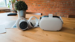
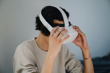
View it in Virtual Reality - VR Design
Although Living Coral is a beautiful color with deep meaning, no one can deny that wearing it makes a fashion statement that may not fit with everyone’s aesthetic. This is where designing with VR comes in handy.
“Colour is an equalizing lens through which we experience our natural and digital realities and this is particularly true for Living Coral. With consumers craving human interaction and social connection, the humanizing and heartening qualities displayed by the convivial PANTONE Living Coral hit a responsive chord.” - Leatrice Eiseman, Executive Director of the Pantone Color Institute (Retrieved from here)
Whether you are unsure about the color or trying your best to make it work in a space, for you or a client, VR allows you to get as close to having Living Coral on your walls as possible before having to pick up a paintbrush. While using VR, you can see exactly what you will be getting. Being immersed in VR allows you to have a perfect understanding of whether Living Coral is appropriate for a certain product or space, helping you in your VR design process.
-
VR lighting studies can be created to understand how it will look at all times of day.
-
Seeing a swatch of Living Coral may tap into your creative mind where you can fit this color exactly. As a bright, it could quickly turn into a visual distraction. Is it best suited to a different area based on how much attention it grabs? Previewing the feasibility of color is a valuable use during your VR design process, as is trying to get a window on any design that hasn’t yet been executed.
-
Decrease your likelihood of making costly mistakes by seeing it first in VR. And if you are a designer and you are concerned that your client may not like living with a decision, using VR to preview the option for them will give you both reassurance that the client won’t require costly after-completion changes as they’ll have deeper understanding and buy-in.
Living Coral is a stunning color that reflects what we need in our current political, social and cultural climate. But it may not be the right one for your client to live with day to day. View this color in VR to bring your vision to life, and help ensure you’ve made the best design decisions.
Here at Yulio, we strive for excellence in performance and integrity when it comes to our product, and customer service. To learn more about how VR can enhance your business workflow, sign up for our FREE 5-day email course. Want to stay updated with everything or anything Yulio? Follow us on Facebook, Twitter or Linkedin!

.jpg?width=245&height=150&name=active-adult-beautiful-1799244%20(1).jpg)