As an architect, telling a powerful story using design comes second nature to you. With a hefty arsenal of powerful visualization tools to pull from, architects are able to create stunning photorealistic images that stylistically blur the lines of what we already know exists and what is yet to come. It is these images and types of media that will help win your clients over and get excited to work with you and your team. However, and it happens to the best of us, sometimes our efforts in communicating our design falls short and doesn’t have the same amount of impact as we intended.
Impending project deadlines and rushed schedules are often the culprits for design mishaps that even expert rendering artists fall prey to. From resorting to cliché trends to cutting corners, these methods for producing visuals can become too distracting, drawing greater attention to the inconsistency rather than the greater picture of your design. And especially if you’re hoping to use virtual reality as a medium to showcase your projects, these mistakes will be further magnified in full 360.
We know that designers are almost always working in a pinch for time. So we’ve listed about 5 of the most common architectural visualization mistakes to avoid. You can treat this as a sort of checklist before sending your projects to your clients.
1. Recycling Scale People & Objects
This is one of the most common mistakes we see architects fall into. While your renderings may feature a stunning design concept, that feeling of awe and excitement can quickly come crashing down when your clients notice elements that they have seen before in passing or in the previous pitch.
Here’s just an example of what we mean:
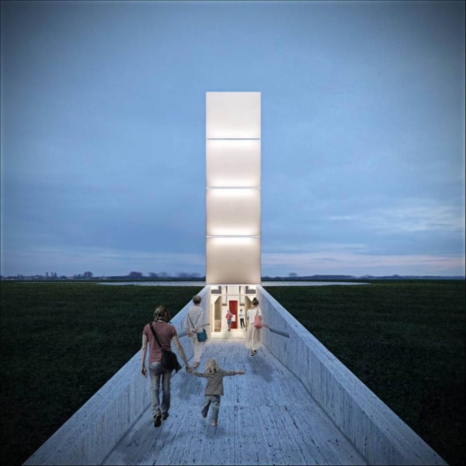
Gustavo Penna Arquiteto e Associados - Freedom of the press monument, Praca Central Brazil
Morfè Architettura - Opera and water City - area of the former lace factory Türck. Pinerolo, Italy
One of the most infamous examples of overusing the free-to-download collection is the “woman in beige” or also known as “little red riding bag”. Unfortunately for rendering artists, her outfit and style is a great match for a variety of designs, leading to her appearance in works like Freedom of the press monument and Opera and Water City.
Although it may seem relatively harmless, this small yet mighty oversight can quickly steal away your audience’s attention from your architectural concept to that specific element. And when you have lost your client’s attention for those few moments, they can lose out on listening to pertinent details that are key to both your pitch and overall design.
While we are in no way advising against using free and accessible elements, it’s important to use them in moderation and keep a well-stocked library of diverse figures and objects to avoid repetition. Remember to keep track of which elements you have already used with a certain client or make note of one that may have popped up in a competitor’s portfolio.
2. Overcrowding with Details
If there’s just one thing to take away from this post, it’s this: keep it simple.
The design industry has already made the shift to a “less is more” approach, favouring minimalism and simplicity to communicate powerful design stories. This change in industry taste already sets the perfect foundation for designers, but it’s still important to note as nothing chokes out a solid design concept like adding an army of extraneous details.
Whether it be adding one too many trees or a hanging lamp that just doesn’t make sense, too many of these additives can leave your clients feeling distracted, puzzled, or lose interest in your design. Plus, it can add to the tone of your design but not in the way you would hope. This type of disturbance can dilute your design intent, making it harder for your clients to understand your vision with clarity.
To avoid showing too much all in one go, ask for a second opinion. Design can sometimes feel like a lone wolf career, however if you have a team, supervisor or even a friend, asking for their input can help you catch mistakes or try a new solution you never thought of before. So tap into all the resources (including your team members) that are available to you to help you create a better end product.
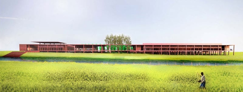
David Adjaye - Varanasi silk-weaving studio
3. Capturing the Wrong Perspective
Another mistake we see architects make is capturing the optimal perspectives for 2D rendered stills. 2D renderings are the industry-standard visualization tool, allowing designers to take a snapshot of their design just as anyone would take a picture with a camera. This visualization tool is effective and an essential part of any pitch or portfolio giving clients and prospects the chance to understand a design in a digestible and concise manner.
Working with stills is an art in itself where designers have full reign to fully express their visual story and captivate their audience by showcasing their projects in a way best represents what they have in mind. However, such flexibility can produce lackluster angles that might work against your design rather than bring forth all the best parts of it.
To help you get the right perspectives, here are a few tips and areas to consider when communicating your designs:
- Think about the angles - not too high, too low or too far left or right. Strike a balance that will guide the viewer to the main focal point of your design
- Use a grid to help you visualize where every element is sitting
- Don’t forget to pay extra attention to size and scale. If something is off in this area, it can completely through off your design
- Make sure the most important aspects of your design are front and center - make it very easy for viewers to see what you are trying to communicate
- Choose your environment wisely, it should always add to your design and not steal the show
%20(1).jpg?width=800&name=BUSINESS%20READY%20VR%2084%20(3)%20(1).jpg)
4. Not Double Checking VR Experiences
In a similar vein, take a look at your perspectives on your VR platform before sharing them with your clients. We’ve heard from our Yulio users that while designing for 3D experiences was simple and required much of the same steps as 2D renders would there were a few more considerations they needed to take into account.
With 2D renders, you’re merely capturing a single still snapshot of your design. However, with virtual reality, your clients can step into your vision and essentially digitally walk through your design to scale. This means that anything a person would do when exploring a new space - looking up, down, and all around - they would absolutely do in VR. And these are all points you will need to double-check work fluidly before presenting with VR.
We recommend before any pitch or presentation to upload your project and take a test run walkthrough. Not only will this help you catch any major and minor mistakes, but it allows you to explore your design like your client would, helping you get a better idea on how to best optimize your project for an outstanding experience.
.jpg?width=800&name=apple-business-computer-connection-392018%20(1).jpg)
5. Rushing to Finish
And finally, don’t forget to pause and take a step back. A lot of the time when you’re in the zone, chances are you have zeroed in on all the small details you need to add in rather than the bigger picture. And sometimes the direction you were initially started with might actually be the one pitfall of your design.
It can be daunting, but it’s okay, if not necessary, to take a step back and see if your design is executing the idea you or your client may have in mind. It’s easy to fall into the trap of using techniques and trends that may not actually serve the purpose of what you’re trying to achieve. So whenever you can (the more the merrier), take a breather, give yourself time to reset a little, and look at your design with a refreshed perspective. Doing this more often than none can help you catch any mistakes before you venture too deep into a concept that would be implemented incorrectly.
We hope that you found these tips useful in helping you avoid future architectural visualization mistakes.
If you’re interested in rendering unlimited* projects and perspectives, learn more about our cloud-based rendering platform: Yulio Jump for SketchUp and CET Designer. Render as many projects and capture the perfect perspectives. If you’re looking for expertise in creating your next project, get in touch with our partners at KiSP Inc. and their Visualization Services team. Learn more about their 24-hour** turnaround time and the services they offer here.

*We reserve the right to investigate and limit unnaturally high usage driven by multiple users or other circumstances. But we’ll always reach out to discuss it with you and find a solution.
**Timing varies depending on the project