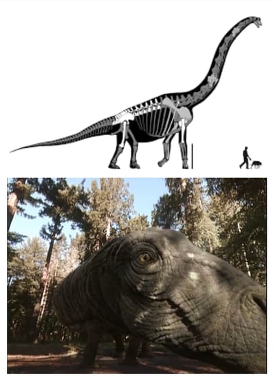
When you see a picture of something, and then you see it in real life - it’s quite a different experience, isn’t it? Imagine being in a museum and seeing an image of a dinosaur standing next to a person; you’re probably thinking, “wow, that’s a big dinosaur”, and then shrugging it off. But imagine if you could experience that same dinosaur, but standing in the same room as you, and moving closer and closer. I bet your reaction would be quite different - I know mine was.

Scale and engagement are things that VR shows off really well, and actually, they’re some of the major selling points. Virtual reality has this punch of power that shows you exactly what something were to look like as if it were physically in front of you.
When it comes to design, getting a real sense of space and scale for a project is crucial, especially when it comes to seeing what works and what doesn’t. That’s why designing in VR is so critical to saving you time and letting you iterate and play. You could think one design is perfect, but when it’s actually executed you could realize that a window is too small, or a ceiling is much higher than it needs to be. So, large and small-scale projects alike, designing in VR can play a huge role. Dan Sobieraj from Island Life Tiny Homes and his team know the ins and outs of designing for limited space, and how to use VR to do this more efficiently.
Dan shared some of his design tactics to help us better understand his designing in the VR process and how VR improved his project.
How tiny is too tiny?
We did a lot of our designing in VR to visualize the spaces and determine if the critical spaces, such as the loft and the washroom felt "too small". There was a lot of back and forth to check if the height of the loft was comfortable, and to make sure that the washroom didn’t feel claustrophobic. VR allowed us to quickly make changes and rapidly recreate the visualizations.
See what the lighting will be like before the electrician begins.
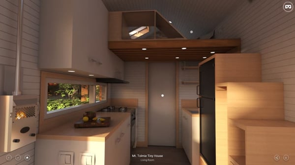
VR played an important part in experimenting with lighting. Good lighting is important in making a small space feel bigger than it is. We wanted to maximize the amount of daylight entering the house in order to eliminate the use of artificial light during the day. VR allowed us to ensure that our lighting would work in the real design.
Creative storage was so important!
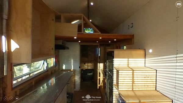
We used VR extensively to iterate the loft and create options for storage that can be built in later by the client according to their preferences. By visualizing the house in VR we picked up on things such as the obstruction of sight lines. For example, we decided to create a storage solution that also acts as a guardrail on the loft. After realizing it was obstructing a nice view of the living room, we decided to redesign it and make it possible to see through it. There’s no doubt that designing in VR helped us spot problems early, and utilize the space much better.


Know what the materials will look like together ahead of time.
This is probably one of the most important reasons; we were designing in VR to see if our finishes were in-line with our concept of making the space feel larger. We used VR to see how the materials looked in different lighting conditions. Light coloured walls and wood accents were used to maintain a light space, but with an interesting material palette. We even used VR to see how the orientation of the boards on the interior affected the perception of the space. We used a horizontal orientation because it made the space feel wider as opposed to a vertical orientation, which would make a space feel taller but more narrow.
Busy lives means designing remotely.
We were ambitious and thought we could finish the house in 4 months. This did not happen and we were so used to being able to make some design decisions on-site in the real house. Designing in VR was a great solution to be able to continue making design decisions while away from the real house. It was also a great way to share design ideas in a team environment because you would understand the design completely, unlike 2D drawings that can sometimes leave room for misinterpretation.
Sharing designs is easy!
VR proved to be very useful when people would visit the house while passing by or for open houses. It helped potential clients visualize the final design even though the house was still under construction while standing in the house itself but viewing through a VR headset. It also allowed us to share the vision of the house online to anyone. I’ve also used VR to document the house during the construction phases for documentation purposes.
See Dan and his team present their tiny home and how they went about the design process from their renderings to construction here!
VR is a great tool if you already use images to convey your projects or design iterations to clients, and Yulio integrates easily with workflows of all kinds. Want to know some of the unique ways you can make your presentations POP with VR? Check out this blog post outlining some of the awesome ways you can improve your design process and impress your clients!
Do you want your clients to have that “wow” VR experience with your projects? Yulio offers a free full-feature 30-day trial for you to test the waters of designing in VR and see if it is right for you or your practice. Or if you want to know more about the power of digital reality, you can check out this blog about what VR shows off best here!


.jpg?width=245&height=150&name=active-adult-beautiful-1799244%20(1).jpg)

