Think about what you would do if you walked into a building that you’ve never been in before. Your sense of how to navigate it is a core part of what we want to impart today about VR design principles.
Human Instinct is Key
Going back in time, humans have learned to navigate spaces differently, so to design in virtual reality, you have to understand how people think.
Back in the early days of a human-populated Earth, people relied on their natural instincts and honing in on their senses to survive. So things like having a good vision for long distance was really great to have for them and looking for irregularities in their environment that would be a red flag.
Fast-forward to a more modern era of thinking, we rely on a much shorter distance of sight. We’re not hunting for food or always keeping an eye out for predators, but rather we’re looking for signs, whether that be something like a road sign, a digital sign, or something like a natural instinct kind of sign.
Our generation of humans has seen the transition from items being physical objects into the digital (two-dimensional). Think of apps on your phone like calendar, notebook, and timer - we’ve adapted to this new interaction model that makes multitasking much easier, but decision-making much more difficult.

Consider looking at a landscape in VR... you come across a dark forest to your left and a bright clear path on your right, and you must choose between the two - The majority of us will recognize that the dark forest is filled with a lot of uncertainties and that triggers a sense of danger, whereas you can probably see that the path is lit up and you can see that there is no danger, so you’re safe to continue on. Now let’s say that there are signs for what is to your left and what is to your right… it takes some time to digest what the signs say, and what they mean. The real difference between the two is that people now have experience with reading signs and identifying cues based on the icon, the text font, the shape of the sign, and minuscule details like that. So, deciding which path to take in the second scenario is less intuitive, and ultimately takes some more time.
Our advice?
So one thing you can do when you approach applying VR design principles is insert hints that will cause your users to pick up on their natural instinct of wayfinding and cues that can push them in the direction you want them to go without physically inserting a sign that says “go this way”. When people view scenes in virtual reality, they’re looking for that staple immersive experience that leaves them wanting more, so make your experience explorative and intuitive, and see how much of a difference it makes for your narrative!
You Can Control Perspective!
Picture yourself standing in a large empty room with only a chair across from you (let’s say 10 feet away). If you walk towards the chair, it will appear to be getting larger - Now picture the same scenario, but when you walk towards the chair, it doesn't budge, you’re not any closer to the chair than you were before you started walking towards it. Controlling this is a core part of VR design principles.
You have options for where you want your content to sit in your virtual space. It could be like the first scenario, where, like a normal day at home, your perspective is normal. Sizes and angles change based on your proximity to the object and your head position. OR, you could make it more similar to the second scenario. The content is locked in a certain position, and there is no way of changing that. There is no such thing as closer or farther away because you’re locked from seeing it any differently. One other scenario would be locking the content to the environment you’re immersed in. For this, think about a hologram - it’s floating in free space, but its locked to the environment you're in.
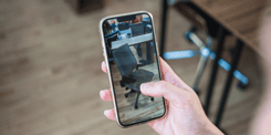
.jpg?width=450&name=saketh-garuda-622962-unsplash-768x1024%20(1).jpg)
Our advice?
Place content with purpose. Make sure that if something is sitting in your virtual environment, it has some sort of meaning for the user. There should be intentions behind the placement of items. We recommend a camera height of about 64” to replicate ‘eye height’ for most viewers - paying attention to these kinds of VR design principles will ensure your viewer experiences a scene with standard heights of things like doorframes etc. and standard sized. Failing to consider this can create a disorientation that makes users less engaged with your scene.
Think about designing a virtual escape room (where every detail matters!) For the most part, you want your users to be able to see all the angles and perspectives of content in the room; however, you’ll also want to lock some content in place, and maybe allow for floating text/voice prompts to appear for them. The focus will be making details, no matter how small, count.
For more insight on creating content for VR and how to design better for VR, check out our Whitepaper by clicking below.
Look around!
Hey VR designers - you’re not just designing for one screen, but an entire world! You have a full scope of vision to design for - so keep in mind every head turn and remember - design for behind you too! We touched on some helpful tips in a writing piece before, as well as a past blog which you can read here.
This one seems like the obvious tip but it’s honestly one that is easily forgotten. We’re so used to a flat-screen 2D digital experience where you can see everything- where you’re looking at a screen and you have a fixed set of commands and you seem to know more or less what’s all around you with the help of strategic camera angles and zoom.
The difference is, that in VR you have a small cone-of-focus, similar to our range of sight, but even smaller. With actual sight, we have the advantage of having a blurred peripheral vision, but in VR this range of vision isn’t quite as large. When you’re gazing into a VR headset like a Gear VR, you’re actually looking into a split-screen smartphone which not only divides the image but the resolution as well. Your eye will focus on the center of each of these lenses, which leaves the rest of the scene blurry. Don’t let this scare you when it comes to design though because there are ways to solve for this small cone-of-focus!

Our advice?
We have 4 core VR design principles that can help improve your experience for our small cones-of-sight.
- Design for a flat surface - yeah yeah, VR is meant to be immersive and offer 360 degrees of intriguing content, but if you’re trying to get your user to focus on one thing in particular, show it to them as if it were a fly on a wall. There’s no sense trying to put crucial information in a VR scene if your user is never going to find it, nonetheless be able to read it!
- Design on the curve - If you use this method, the information will always face your user, and be on enough of a curve that is it clear and readable.
- Put the important information closer to the users cone-of-focus, and less important information behind that - This hierarchy will let the information stay accessible, but it keeps it organized and out of the way for other content to take the spotlight.
- Keep in mind how your user is viewing your experience - The cone-of-focus and range of vision is going to be smaller in something like a Google Cardboard or Homido Mini because they don’t offer any peripheral viewing, however something like a Gear VR or an Oculus Go do allow you to have a wider range of vision. So when you’re wondering which approach is best for you (where to place important content in a scene) keeping in mind the vehicle that is driving your experience can make a serious difference!
Build around what we already recognize
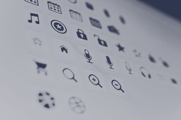
Think about your smartphone, and how you went about learning your newest upgrade. No, not from that sweet promo at your local mobile store, but how you went about learning how to use a new phone again. Technology follows the same path most of the time because the way it is is how everyone understands it to be. Virtual reality design principles aren’t new and alien just because of the technology -they follow a shared understanding of storytelling. We understand what a Wifi icon looks like, or what a calendar app might look like - and I bet we can even recognize the less popular icons within our phone. Our first instinct as humans is to relate back to information we already understand, which is why we can pick up new technology so fast. There is this book of well-known language and symbols that we can immediately pick up, and therefore have become an industry standard.
Where this becomes more complex is where VR intersects with this universal world of symbols and language. Take into consideration how we identify a link from regular text when you’re on your laptop. Usually, the text is a different colour, underlined, maybe italicized, may be enlarged, maybe bolded or all of the above, but sometimes you rely on your mouse to hover over the text to see if the link will pop up indicating that if you click it, you’re going to be taken to a different web-page. Now in VR, only certain headsets come with hand-held remotes which makes applying this same concept more difficult.
Our advice?
If you’re thinking of designing a space, use symbols and language that people already understand, and in the case of VR, use gazes and gestures that are already well-known, and make sure to highlight them as instructions to your viewers before the experience begins (if necessary)
Focus on Experience
Virtual reality is simply an experience. You want to immerse your audience into a scene and to do that, you need to keep a few core VR design principles in mind when you’re designing. These will not only improve the quality of experience, but it will also improve the comfort level of those experiencing it:
Our advice?
- The less movement the better. Some people get sick when they’re in VR (it only takes milliseconds from what your eyes see and what your brain perceives to get that woozy feeling)
- If there’s a line that details a horizon, keep it still. Similar to the last point, it only takes a second to get a user sick
- Ease your user into scenes slowly. There’s nothing more disorienting than moving from one space to another in one abrupt motion. Make sure to include scene transitions that will ease the user in.
- Aim to keep your user comfortable. Try not to make your environment too complicated by avoiding constant movement of their head or body. Not only can this bring on sickness or disorientation, but you also want to take into consideration the user’s comfort level. Are they sitting or standing? Where? In an office or on a place? Are they using tethered VR (a.k.a have limited mobility?) These aspects are all important so think of who your main audience is.
- Be mindful of what in your scene is meant to be 2D versus 3D. The change between the two can be disorienting.
- Keep the information in front of your user simple. There’s nothing worse than when you’re on a screen and you have a million pop-ups in your face. Users in VR want to explore, so let them find details as they go.
- Don’t make your scenes too bright - bright lights on your eyes can cause fatigue and it can just be too straining for many to look into for too long.
What you do with these virtual reality design principles is up to you. Exercise your creative virtual freedom and create lasting immersive experiences that will tell your story in the most interactive and unique way possible!
Amping up virtual experiences can be the difference between someone thinking your design is nice, and giving them that ‘Wow!’ experience that people expect VR to have. Check out some of the ways our clients have used Yulio to enhance their experiences here! Want to create or view your storyliving experience in captivating VR? Sign up for a free 30-day full access Yulio account here!