Last week, Yulio attended the fiftieth anniversary of NeoCon, the most important event of the year for the commercial design industry. Here, we got the pleasure to speak to some amazing industry leaders and see some spectacular showrooms in the process.
NeoCon 50 was all about the up-and-coming trends to hit the commercial design industry for 2018 and 2019 - and now, we want to share the major office design trends that we saw there with you!
Comfort and Durability were Key Players
The main trend that seemed consistent throughout NeoCon was the push towards how aspects of a home can be shared with commercial and hospitality spaces as well. This concept invites a more warm and welcoming atmosphere by inviting comfortability and durability within the same space.
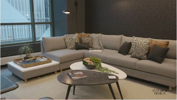
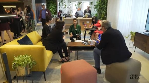
To give you an idea of what we’re talking about, think about how offices are beginning to have a more comfortable collaborative-type feel such as including a plush sofa made of a light but durable material to stand the test of time but also being able to facilitate strong conversation. This would make what was intended for relaxation and comfort to transition into a more functional and social space for ideas and productivity to spark.
Bringing the Outdoors in
Another huge office design trend we saw is the idea of bringing elements of nature and organic materials into indoor spaces. You’ll see the incorporation of plants, greens, wood grain, furs, stones, and similar materials being used in a way that enhances the contrast within textures in opposing materials, while also adding a more acoustic experience for the room.
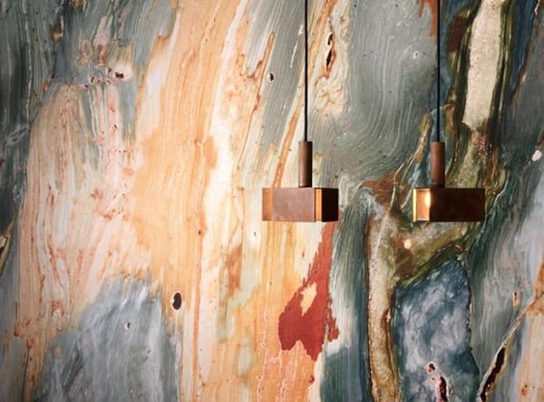
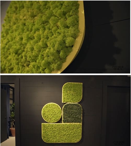
You’ll not only see this with materials used for furniture, but in wall coverings, room embellishments, and accents for a sense of freshness and life, and to bring our human instincts back to their roots wherever we may be.
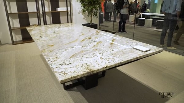
The addition of natural embellishments within space design adds a luxurious feeling towards what used to be stagnant materials used in commercial and hospitality all around the world. The natural and polished look appears much more contemporary and visually interesting. Who wouldn’t want to brainstorm around this kind of boardroom table?!
Rich Layered Textures
Textured layers are another large trend that were fairly consistent throughout NeoCon. Following the use of natural materials, by incorporating contrasting textures allows for a lot more visual stimulation within a space.
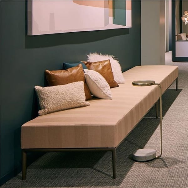
You can focus a lot more on the detail of individual pieces with contrasting textures, but you’re also able to see comfort regardless of what materials you favor over others.
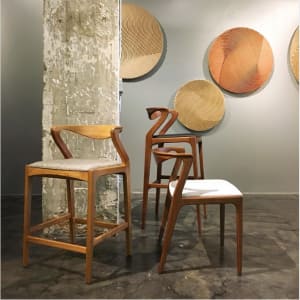
Again, here you see designers using wood, a natural material as an inspiration for many looks. These chairs look almost hand-carved, the partitioned wall has an appearance of a deteriorated birch, and the plaques on the wall appear like they’re tree rings, but in fact, are made of a brushed metal.
Think about complementary colors - if you want a color to pop, you’re going to put it against the opposing color to make the largest contrast. Having rich layered textures not only makes a space more visually appealing, but it allows for a combination of sleek materials to shine their brightest.
Repurposed Materials and Concepts Shine Bright
This one might not be a brand new concept for commercial design, but reviving the old and turning it back into something new is always a breath of fresh air when it comes to designing a space. Again, it’s the contrast of materials and what technology can do with the materials now that makes this look so stunning.
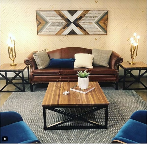
Notice the different textures from leather to iron to metal to plush to woodgrain to velvet - this room has it all. Even the candlesticks on either end table - an older concept that has been revived to be something new with light bulbs inserted into the base of the design. This design is a refreshed look on an old country living room but in the modern era.
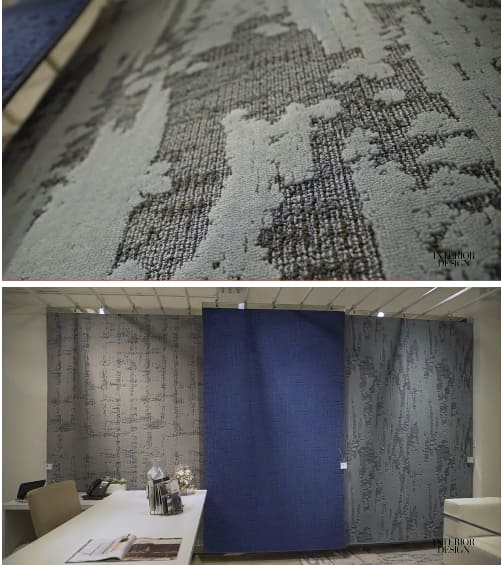
Here we see one more example of how NeoCon was reviving the old and turning it into something completely new and different. These rugs were inspired by the beauty in imperfections - They embrace a rustic, old, and deteriorating look and feel, while also being natural, organic and with an unstructured pattern to complete the design.
Let’s talk patterns
In terms of colours and patterns that were popular, we see a lot of this rose gold colour that has erupted in the last few years make an appearance in the commercial design industry, as well as deep green colours to pair with the natural accents around the spaces, and we also see a lot of warm greys in many of the office spaces.
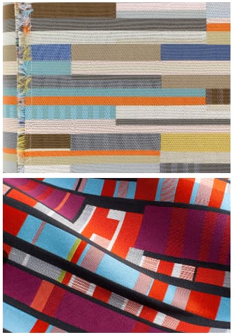
The patterns that made a forefront at NeoCon are driving from what used to be more neutral and conservative trend back to a more mid-century modern and vibrant look and feel. These designs have a blocked pattern, but you’ll notice that they don't have any sort of vertical pattern or design repetition, which makes it have more of a natural effect because there is no distinct line where a pattern repeats.
Unique Wall Coverings
Now, diving into wallcovering trends that were spotted at NeoCon, we’re embracing this same natural organic texture and pattern but throwing it on the walls. Again, as we saw with the color and patterns this year, we see this same concept again in wall coverings. The designs have no distinct line or clear repetition which creates a more natural look and feel which is just so visually stunning in a space.
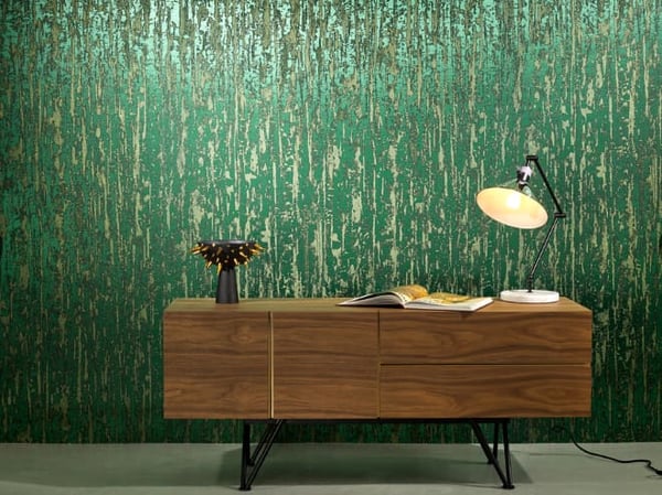
They seem to be playing with the organic patterns and metallic embellishments which creates this interesting and reflective look that appears very naturalistic but modernistic as well.
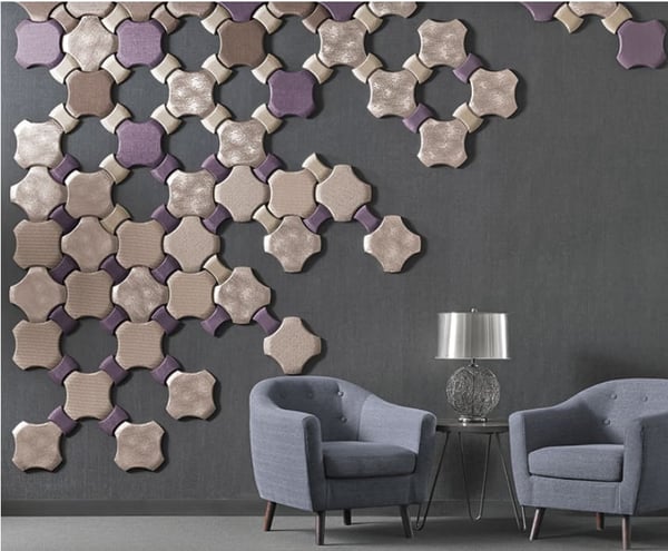
You’ll also notice small details like what look to be kitchen or bathroom tiles but in a completely inflated and deconstructed pattern. This is an interesting design choice to be an accent towards specific pieces in the room, for instance, in the image above, the wall tiles are accenting the stainless steel lamp shade with a woven metal base. This wall covering design seems to be coming from an older design trend of ‘ombre’, or the transition from one stark colour or texture to the next (so this would be the transition from protruding and metallic to a more matte finish) and also creates this balance on this wall with how the furniture is placed.
There you have it! Some of the stunning office design trends that we took away from the one and only NeoCon! We look forward to what NeoCon has in store for us for next year, but in the meantime, we’d love to share some of our fun experiences with you. Check out some of our memories from the show here.
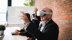
VR is a great tool for showing off your products, which includes furniture, wall and floor coverings and much much more. Interested in virtual reality? Learn more about VR for business through our fast 5-day email course here and kickstart your learning today!


.jpg?width=245&height=150&name=IMG_20240610_170251203_HDR%20(1).jpg)
.jpg?width=245&height=150&name=active-adult-beautiful-1799244%20(1).jpg)
