Finding yourself facing your first VR designs and drawing? Don’t worry, you’ve got this. Our simple VR design tips will show you ghat VR is still design –but a design that creates an immersive experience and therefore emotional connection, and less ambiguous presentation of your ideas. If you’re beginning your first VR design, focus on the design elements, then apply the tips we’ve outlined below and take advantage of our 1000+ hours of VR testing over the last 15 years.
Our VR Design Tips for Your First Projects:
Look behind you
There’s a fundamental shift happening in design. Where artists once had full control over the narrative, viewers are now able to focus on any element they wish. They won’t be staring straight ahead at all times. You can’t force a 2D design concept into 3D space, and if you aren’t adapting, your designs won’t meet the new expectations of your clients to fully investigate your presentation. You’re used to setting a viewpoint into a scene, something that sits inside a frame, but VR is controlled more by the viewer. Users can turn their heads and of course, look behind themselves. If viewers turn around to be confronted with a blank abyss, you’ve lost the sense of immersion. That doesn’t mean you need to take the time to create everything in the scene at the same level of fidelity as your primary view, but you should plan for what viewers will see behind them. By extension, consider the ceiling and floor - we hosted a contest for architecture students at Yulio and received a number of entries that had blank white ceilings since the designers weren’t accustomed to the idea that we’d be looking up in their renders. Even more jarring - the one that had no ceiling at all. That's when we knew we needed to lead the charge in providing valuable VR design tips.
Use real-world measurements
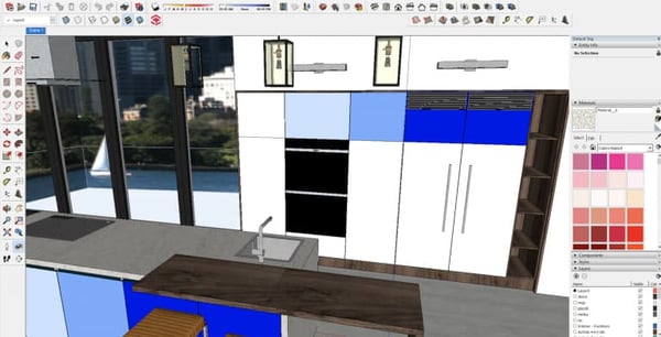
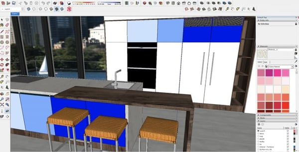
Make your VR experience as pure an abstraction of the real world as possible. Users will see everything in real-world scale and should feel like they’re occupying the space. Having doorknobs, windows and kitchen surfaces appear either too high or too low disrupts the experience. Mixing up heights can also make a design disorientating. Setting your camera view at about 5’6” above the desired viewpoint will create an “average height” viewing experience and give viewers an entry to the scene that you have chosen. You may also need to consider the perspective of the individual who will be using the space. When our interior designers recently showed off a restaurant design, they did so from the perspective both of someone seated in a table, and in a separate scene, from the perspective of a server who would need to navigate the space.
This Kitchen designed in SketchUp has a camera position that’s too high:
Whereas when the camera is properly positioned, the scene feels more realistic:
Create a Story
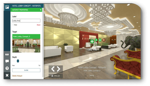
This is our favourite virtual reality design tips as it's one that is most often forgotten about: visually present your story. Once you’ve set your entry points, most designs will flow through various scenes or rooms, which lead the user through your design story. These movements should be based on what clients will want to explore. Using VR software with ‘linkable’ hotspots can help streamline the user experience and connect multiple vantage points or additional scenes. Set up your hotspots carefully so they do not disrupt the visuals and spoil the user’s overall experience. In Yulio, we achieve this partly by allowing you to set the depth of the hotspot in the scene, so it can appear further or closer in space and be part of the natural design flow. Yulio hotspots can also be labeled, although we don’t recommend using too much text in VR – it spoils immersion and the rapid eye movements required to read a massive wall of text can create nausea.
Be a Guide
Consider how you’ll guide your user through the space – is there a logical path to the linked scenes or hotspots, and have you thought about what draws attention in the headset…and if you want it to draw attention? No one wants to have to ask a dozen technical questions just to successfully view a design so ensuring that the navigation is simple and user-friendly will leave clients able to concentrate solely on the design itself. Finally, when in doubt, test. At Facebook, they say “put it on your face”, at Yulio we like to “pop it in a headset”… just look at it in VR, see how the experience feels. Our clients, who are seasoned designers and architects with years of experience have told us they’ve changed the location of a beam, the height of a light switch and the number of skylights in an office that they just wouldn’t have noticed in 2D. All before construction began.
Take a look at some sample designs in our VR design showcase. And when you’re ready to learn more how VR can be a practical tool for your business, sign up for our FREE 5-day email course and how VR can enhance your workflow.


.jpg?width=245&height=150&name=active-adult-beautiful-1799244%20(1).jpg)
